
Project Completed October 2022
Who are HeartSafe and what were they looking for?
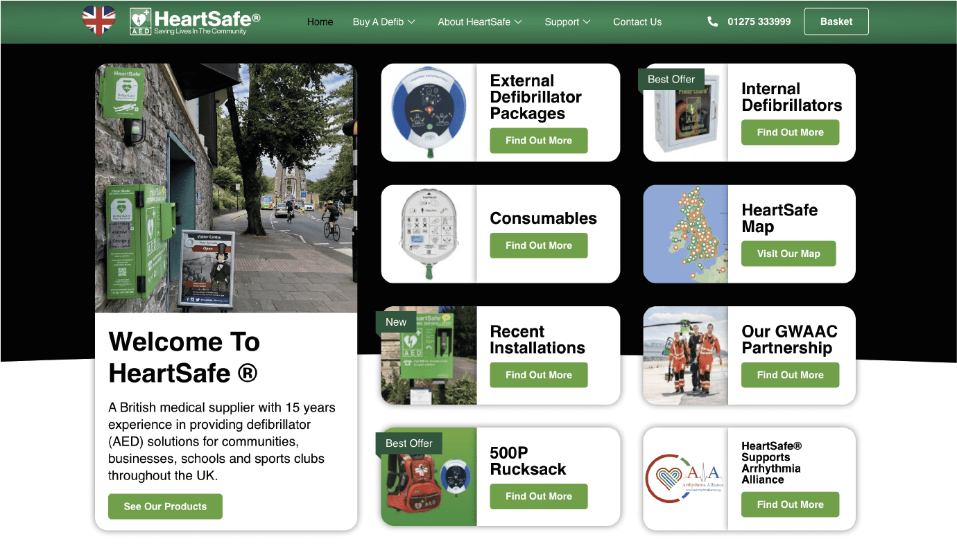
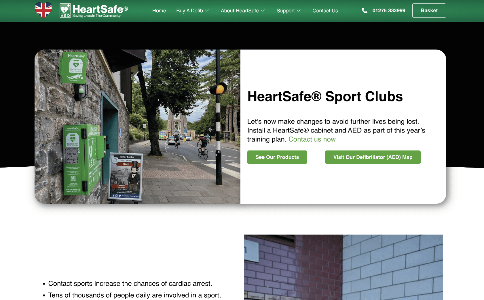
HeartSafe is the UK’s leading Public Access Defibrillator website. Their aims and principles have not changed for many years with saving lives being their first and foremost objective.
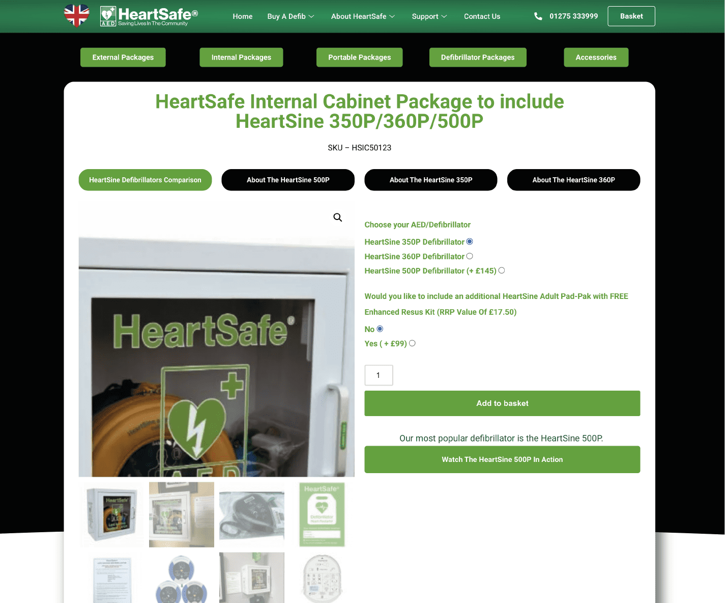
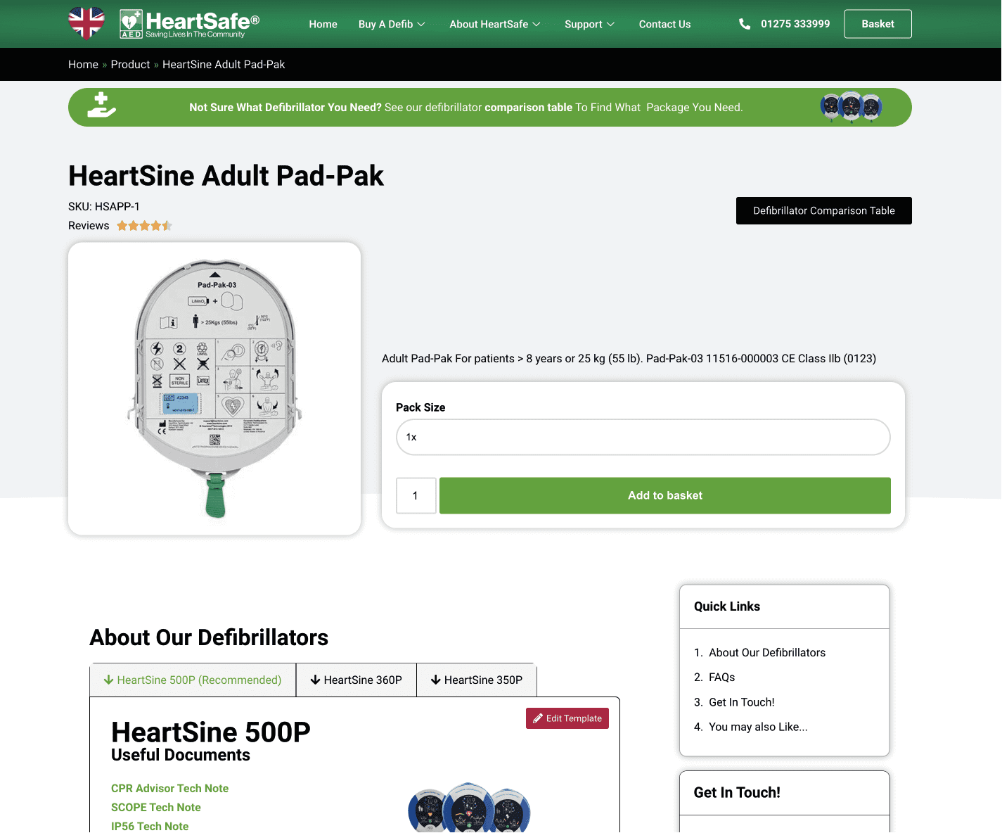
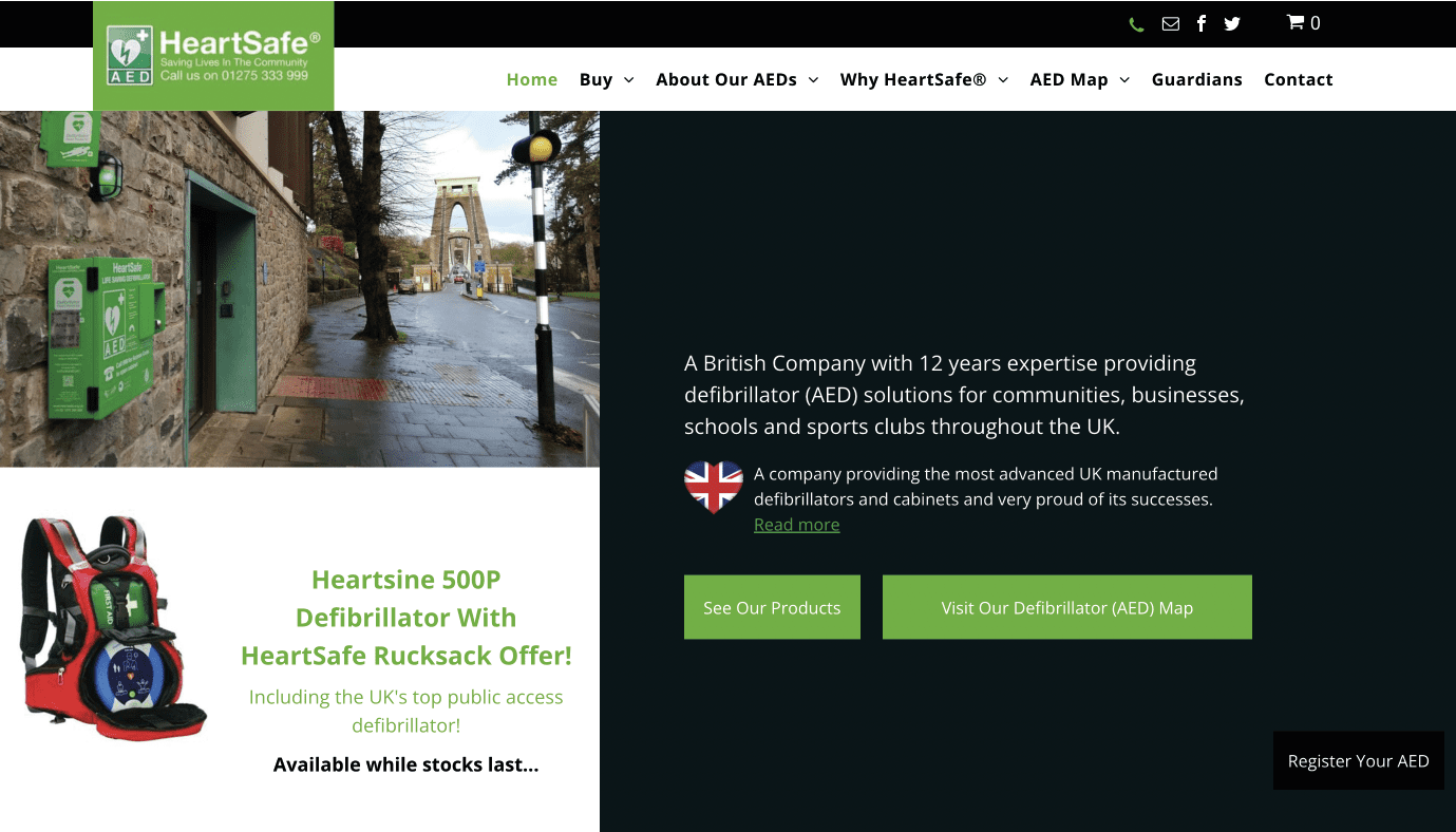
They were looking for a new website that would improve product sales across the website.
The first step once we realised that the current design wasn’t going to work was to look at the fonts that we could use within the new logo. The dark blue represents the original font, while the light blue represents the new font we choose. When choosing this font, we looked at Google Fonts to decide on what font to use to ensure maximum compatibility. This also included a slight colour adjustment as well to make the colours pantone and web safe as well as darker and bolder.
Jan 2019
Aug 2022
Oct 2022
The first step once we realised that the current design wasn’t going to work was to look at the fonts that we could use within the new logo. The dark blue represents the original font, while the light blue represents the new font we choose. When choosing this font, we looked at Google Fonts to decide on what font to use to ensure maximum compatibility. This also included a slight colour adjustment as well to make the colours pantone and web safe as well as darker and bolder.
Jan 2022
Sep 2022
The first step once we realised that the current design wasn’t going to work was to look at the fonts that we could use within the new logo. The dark blue represents the original font, while the light blue represents the new font we choose. When choosing this font, we looked at Google Fonts to decide on what font to use to ensure maximum compatibility. This also included a slight colour adjustment as well to make the colours pantone and web safe as well as darker and bolder.
Aug 2019
Aug 2022
Summary
This website uses cookies to improve your experience. Choose what you're happy with.
Required for the site to function and can't be switched off.
Help us improve the website. Turn on if you agree.
Used for ads and personalisation. Turn on if you agree.