Menu

£46.44 +VAT

Per Computer Per Month

£80.36 +VAT

Per Computer Per Month

£99.74 +VAT

Per Computer Per Month

Project Completed May 2020

2020 Logistics – Logo Design & Branding Showcase

A creative brand concept that gives this fictional logistics company a bold, modern identity

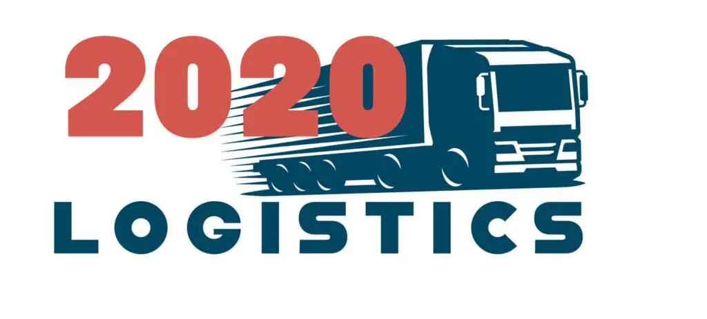
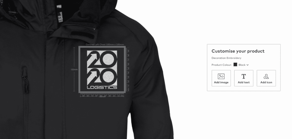
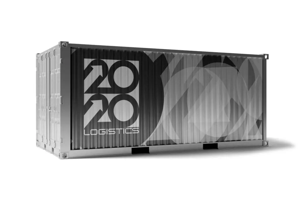
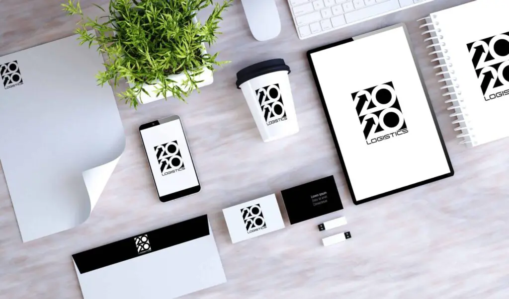
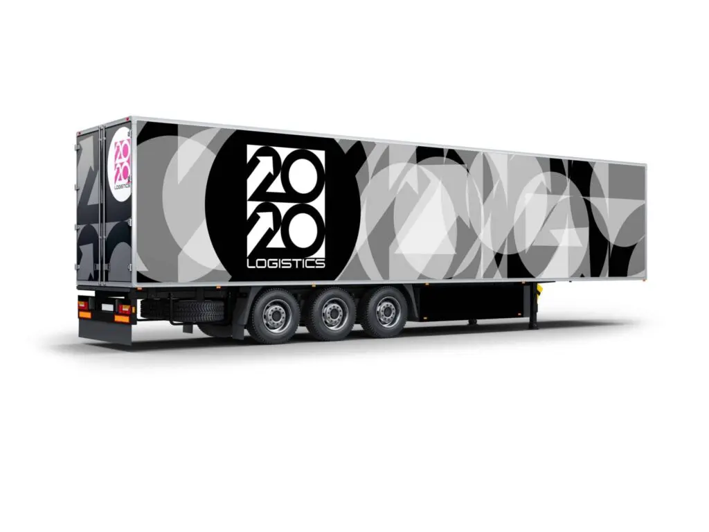
For this conceptual project, we imagined 2020 Logistics as a forward-thinking delivery and logistics business and crafted a distinctive logo and visual brand to match. Starting with multiple design directions and refining ideas through testing and colour exploration, we developed a versatile identity that balances clarity, impact and scale — showing how thoughtful branding can help even hypothetical businesses stand out.

This Project Was Engineered by

Who are 2020 Logistics and what were they looking for?

Project 2020 is a marketing project that aims to showcase the best of what We Do Your Marketing can offer our clients.

Coming Up With A Solution

Initial Design

We started with 3 designs that represent the different ways in which we can take the logo. Below are the first 3 ideas for 2020 Logistics.

Typography

In this logo design, we used negative space to develop 2020 without having an additional element to the logo. This has created a clear minimalist logo that would look good wherever you were to put the logo.

Image-Based

In this logo design, we decided to have used an image to depict exactly what the company does. These can be great to illustrate what services you provide if your company name doesn’t state what you do.

Icon-Based

In this logo design, we decided to use an icon. Icon logos can be great if you often need a stamp to represent your organisation. This stamp can then be placed on images, throughout your website and also used as a watermark on marketing materials

Developing the final design

After carrying out a poll, we found that the typography-based logo was the design to go for. This logo had a positive rating of over 80% while this logo also works on a marketing level as the company name clearly states what the company does – logistics. During the next stage of development, we decided that there would need to be an additional colour added to the brand to ensure that there is always a logo we can use on different backgrounds and surfaces.

We always advise that your company has at least 3 brand colours – 2 primary and one alternative. For the alternative, we decided to use hot pink as it is radically different from the black and white combo which currently exists.

Below are the final iterations of the logo with various combinations to allow the logo to stand out in both the offline and online worlds!

Branding Test

Now that happy with the logo design we now needed to test the logo to see how it would work in the real world.

For this, we made demo images for social media, a normal image, a large HGV trailer, a shipping container, a business card and also clothing.

Summary