Guide Created September 2022
Your website is one of your most powerful marketing assets — but only if you can understand how people are using it. Our Website Analytics Dashboard gives you a clear, visual picture of your site’s performance in real time. From user behaviour and traffic sources to conversion paths and engagement trends, this dashboard brings your most important data together so you can make better decisions faster. Whether you’re tracking campaign success, spotting opportunities to optimise content or improving user experience, having the right insights at your fingertips makes all the difference.
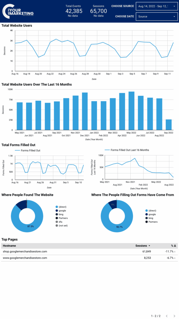
Website Dashboard
Your Google Analytics Dashboard brings your campaign performance into one place so you can easily see what’s happening and make smarter decisions about your advertising.
It gives you a visual overview of key metrics and trends so you don’t have to sift through raw data or multiple reports — everything you need to understand your campaign’s activity is laid out clearly for you.
Why Use a Dashboard instead of Google analytics
Using a dedicated analytics dashboard makes understanding your marketing performance far easier than working directly inside Google Analytics. Instead of navigating complex menus, reports and technical metrics, everything you need is presented clearly in one place — with visual charts, simple summaries and the most relevant data highlighted for you. An all-in-one dashboard removes noise and confusion, helping you quickly see what’s working, spot issues early and make confident decisions without needing specialist analytics knowledge or spending hours digging through raw data.
Choose Date
Choose Source
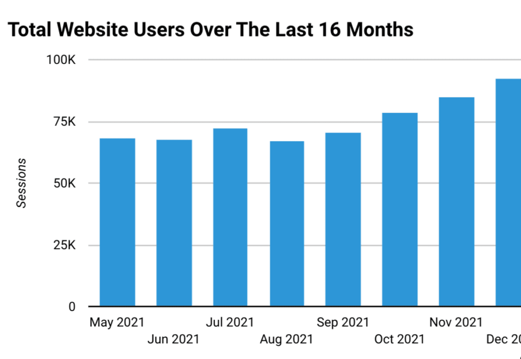
Total Website Users and 16 months
This information has many uses, such as tracking how well your marketing campaigns may be performing, following seasonal changes etc.
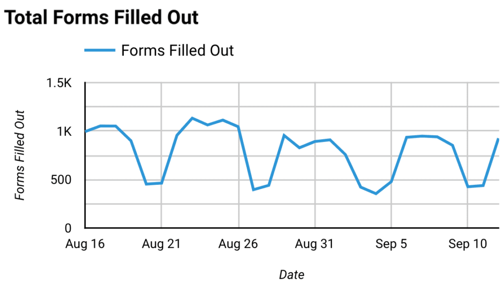
Total Forms Filled Out
This is useful for seeing how effective marketing campaigns are performing and if they are targeting the right audience.
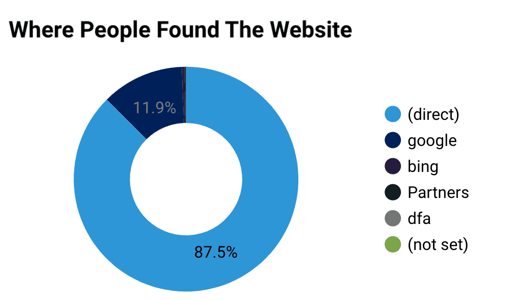
Where People Found The Website
This is useful for seeing how effective marketing campaigns are performing and if they are targeting the right audience.
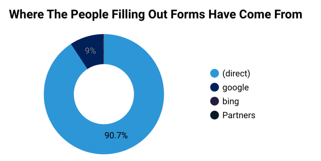
Where People Filling Out Forms Have Come From
Being able to see where the people are filling out the forms tells you what is working well.
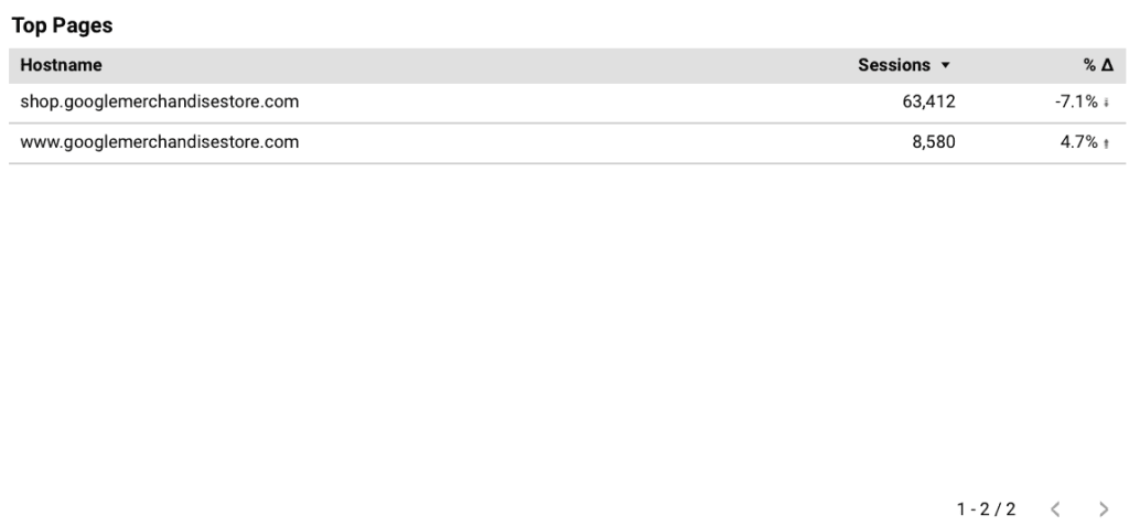
Top Pages
This is the graph of the most visited pages within the time period set in the top right. Use the buttons at the bottom right to scroll through different pages.
This website uses cookies to improve your experience. Choose what you're happy with.
Required for the site to function and can't be switched off.
Help us improve the website. Turn on if you agree.
Used for ads and personalisation. Turn on if you agree.